* Why I chose this project
The UTS mobile app is an official mobile ticketing app to book unreserved train tickets developed by Indian Railways. It currently has over 10 million+ downloads on the play store.
As a frequent commuter on the Mumbai Local trains, I've personally experienced the convenience of the UTS app in saving time by eliminating the hassle of waiting in long ticketing queues. However, the app's user experience has been consistently frustrating, not only for myself but also for those around me who are less tech-savvy. It is this firsthand frustration with the app's booking flow that has driven me to redesign the UTS app for a more user-friendly and inclusive experience.
* Culture Context
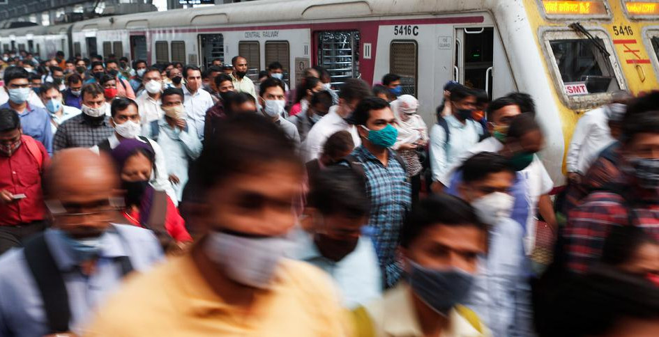
The Mumbai Suburban Railway is one of the busiest commuter rail systems in the world with over 6.2 million daily commuters.
For the purpose of limiting the scope of the project, I’m focusing on the ticket booking flow for Mumbai Suburban Railway, more commonly known as Mumbai Local trains.
Despite the cheap ticket costs, a large portion of the daily commuters travel ticketless to avoid really long ticketing queues and due to the lack of adequate ticket checkpoints. This leads to significant loss in the revenue from ticket sales.
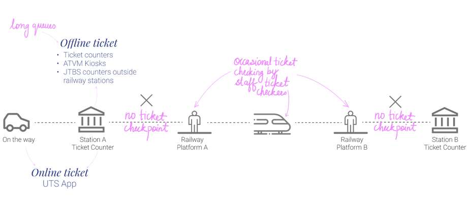
~ What it’s like travelling from A to B in Mumbai Local Trains ~
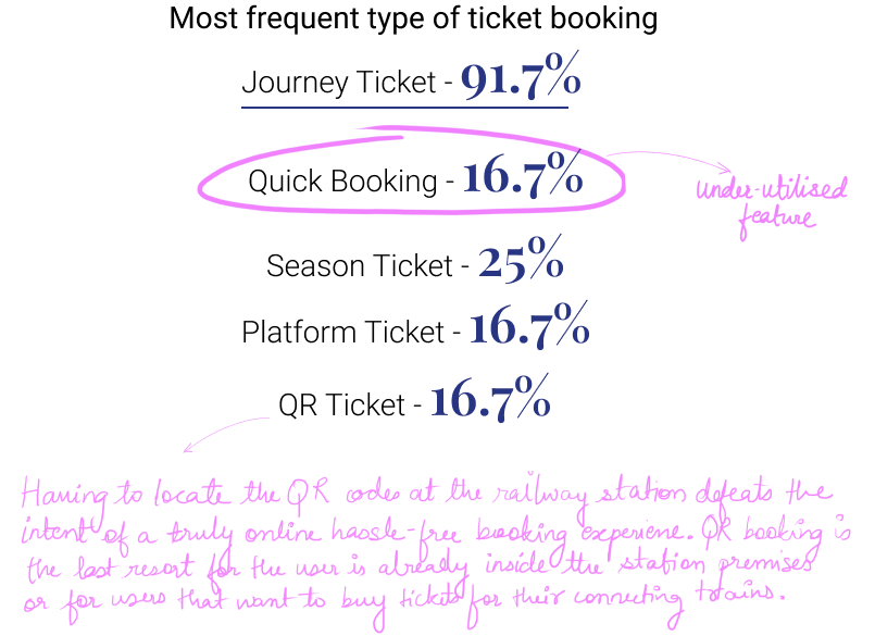
Most common kind of Ticket booking
1. Journey Ticket
* Features in the app
The UTS app solves this major problem by allowing the user to book paperless tickets on their smartphones and avoid long queues.
Fast ticket Booking for frequent journey routes
2. Quick Booking
Only for accessing the platform
3. Platform Ticket
Monthly, quarterly, yearly travel passes for everyday commuters
4. Season Ticket
Initially, the UTS App imposed a 10-meter distance restriction on ticket bookings, preventing any ticket booking within that range of the platform. This QR booking feature was rolled out to enable commuters that are already inside the ticket counter at the railway station to book the ticket by scanning the QR code pasted on the walls of the ticket counter only.
5. QR Ticket

Current app
* The proximity restriction
The users can book tickets between 5km to 10m from the railway track.
Scenario 1: User is on the way to the station
Once inside the railway premises, the user can book tickets only by scanning the QR code at the Ticketing counter. This avoids the need for user to step out of the station premises to book a ticket.
Scenario 2: User is inside the Ticketing Counter


To prevent last-minute ticket purchases by passengers who intend to evade random ticket checks, the booking radius restriction limits the ability to book tickets within close proximity to railway platforms or inside the trains. This measure helps enforce proper penalty procedures and reduces the number of ticketless travellers.
* Initial Observations
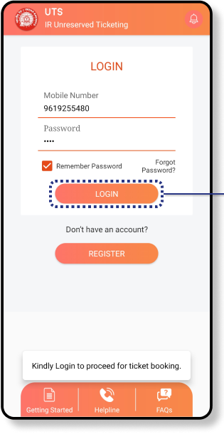
The Log in option at the top is not visible. The users intuitively start the journey booking process without logging in.
Painpoint #1
The Login screen appears right in the middle of the booking process
Painpoint #2
Users are notified towards the end of the booking process that they are in the non-booking zone.
Painpoint #3


* What methods of UX research will help me understand the problem better?
-
Qualitative and Quantitative research survey questions
Collected 68 responses on google forms
-
Online app store reviews
-
Heuristic Evaluation
Research Insight #1
Issue with the booking flow was the major cause of frustation leading to users abandoning the app at the last minute.


Research Insight #2
The app’s cluttered interface and confusing information architecture contributed significantly to the issue.


Research Insight #3
Users experienced a lot of usability and accessibility issues with the UI.

Synthesizing Research Insights....
Whose problem from am I solving?
Every Mumbai Local commuter + Suburban Railway
Target Audience:
Ages 16 to 65, middle income group commuters with a smartphone
Why does this problem matter?
A ticketing system is an essential component of the railway infrastructure. With over 10 million+ downloads on the Playstore, an efficient booking flow and good user experience of the UTS App has tremendous potential to drive ticket sales and help in moving towards a widely adopted digitised ticketing experience.
Scope and Limitations?
The project addresses the unreserved ticket booking ONLY for Mumbai Suburban Railway.
Hence, this project caters to commuters in Mumbai that use the Mumbai Suburban railway as their mode of transport.
Defining the problem statement
How might we make the booking process as efficient as possible to reduce user frustation and drive ticket sales?


* User Personas
The sporadic traveller

The occasional commuter

The everyday commuter

* Information Architecture
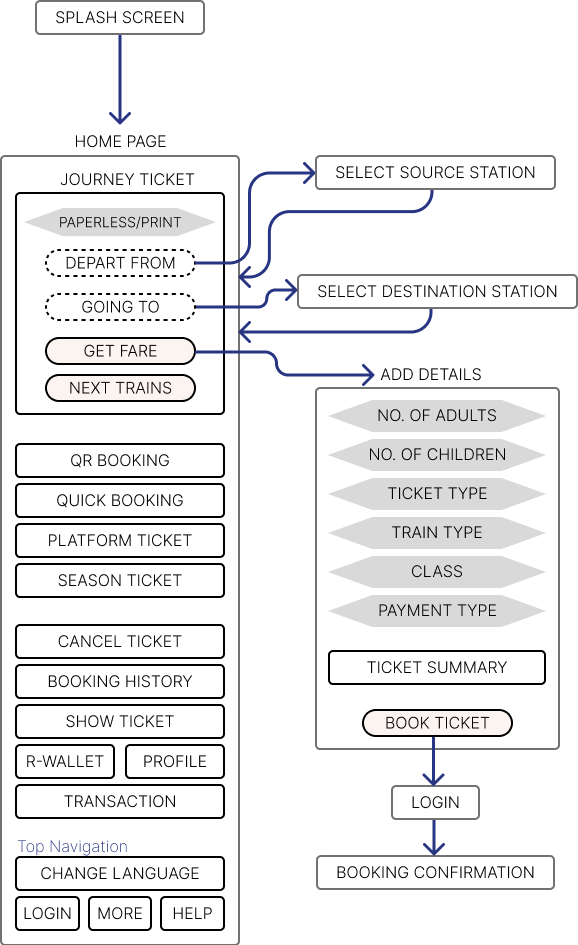
Current IA
Redesigned IA

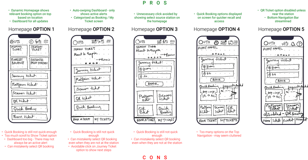
* Low-fidelity wireframes
Homepage wireframes

Providing the Quick booking option on the homepage will lead to better utilisation of the option.
Making Quick Booking actually quicker


The Solution
Functional | Intuitive | Simplified


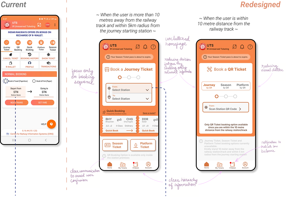
A primary user pain point was the inability to discern their distance from the railway station and the discovery of incorrect booking selection late in the process. To completely eliminate this confusion and minimise error, the proposal is to synchronize the homepage with the user's location and display only relevant booking options as per their location.
Dynamic homepage that syncs as per user’s location
Reducing the unnecessary steps from the process will lead the user faster towards their goal
Streamlining the Journey Ticket booking flow

What I learned
My first ever project taught me....
-
To rely heavily on user research and loose my personal biases. That’s where the true inclusive solution lies.
-
Iterate, Iterate, Iterate
-
Attack the root cause of the issue rather than visuals
With more time, I would....
-
expand the scope to include unreserved Ticket booking for all stations in the Indian Railway network.
-
expand the features in the app to not just booking a ticket, but also for Train schedule, live location and fare table

Users can choose to get notified as they get closer to the station. Other relevant updates and alerts show on the homepage.
Alerts on the homepage
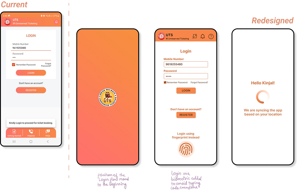
Making the Login easier

Journey ticket flow wireframes

The final prototype was tested with 12 people for these objective metrics
* User Testing
* My design process

Redesigning the UTS App to create an accessible and
user-friendly booking experience.
Streamlining the ticket booking flow and simplying the user interface to reduce user frustation and reduce ticketless travel.
UTS - The official app for unreserved railway ticket booking by Indian Railways
