
Designing for user trust in a high-stakes fintech product for IndusInd Bank.
Status: Live
Shipped a card management web app that empowered users through clarity, trust, and a cohesive experience, ↑driving engagement and loyalty.

PLATFORM
Mobile
TYPE
Consumer facing
TIMELINE
Feb - Jul '24
COMPANY
Parallel - Product Design Studio
MY CONTRIBUTION
End-to-end design of features
including Informal
User research, Competitor Analysis,
Journey Mapping, Interaction
Design, Visual Design
THE TEAM
Product Design Intern (Me!)
Design Strategist @ Parallel
Product Designer @ Parallel
Product Managers @ Hyperface
Engineers @ Hyperface
PRODUCT OVERVIEW
IndusInd Bank CardsHub is a web app for users to view and manage their credit card.
Users can perform various actions like Track their spends, manage their transactions & limits, convert transactions to EMIs, avail offers & a lot more...

THIS IS HOW IT IS RIGHT NOW...
The previous experience of managing their credit card was fragmented across SMS, email & Indus app.
...which lead to increased user frustration & subsequent customer support requests.
HENCE, THE BUSINESS OBJECTIVES WERE TO


Boost user engagement

Enable cross-selling of banking products

Reduce customer support requests
THE CHALLENGE
How might we create a seamless credit card management experience to improve user engagement on the platform?

SOLUTION HIGHLIGHTS✨
Designed for retention through increased user trust & delight
Created a credit card management experience that is on par with market standards!
Ensured a sense of control for the users over their card management experience
An experience that is delightful! not just intuitive

FEATURES I DESIGNED ⛭
A frictionless card activation experience
Designed a user-friendly card activation journey that simplified mandatory security steps, reduced drop-offs, and kept users informed throughout the process.
Focused on creating a clear, intuitive, and delightful onboarding experience while adapting to changing tech and security requirements from Hyperface and IndusInd.

FEATURES I DESIGNED ⛭
Designed for transparency and user control while converting transactions to Equal monthly payments.
The interface provided transparent details about charges, installment options, and payment breakdowns, empowering users to make informed decisions and manage their finances confidently.
This approach balanced user trust and business goals by fostering clarity and reducing decision-making anxiety.


THE IMPACT
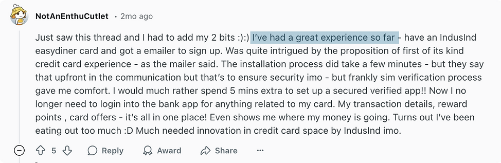
Increased user engagement*
The product is in it's early rollout stage - the secure login link to CardsHub has been sent to select customers. Early customer reviews online show increased user engagement.
Hope to receive more impact metrics as the product is launched to all of the
2.2 million credit card users
THIS IS WHERE I CAME IN

let's dive deep into a feature I designed

Card Tokenisation
WHAT IS CARD TOKENISATION?
Card tokenization is a security process that replaces a card's number with a unique token to protect sensitive card information

THE ASK
IndusInd wanted to offer users control over managing the tokens created for their IndusInd bank card on the CardsHub
including actions like...
1. Adding card tokens at new merchants
2. Pausing a merchant
3. Deleting card tokens for a merchant

INFORMAL USER RESEARCH
Currently, users can tokenize their card only through payment gateways on merchant apps. I conducted informal user testing to understand how users perceive the tokenisation process, whether they feel confident to secure their card, etc.
INSIGHT
Users had no idea what it meant to secure their card.
Informal user testing revealed that although the feature was very beneficial, users perceived it as saving their card on the merchant app. This presented a need to solve for feature adoption.
TECHNICAL CONSTRAINTS
Apart from solving for feature adoption, tech constraints put limitations on the how those tokens could be managed (actions related to pausing/deleting tokens)
Hyperface could not retrive the following information
Phone number associated with token created on Merchant apps
Date when the token was created on Merchant apps

~ Me and the design strategist derived a matrix of available information to ensure alignment with Product Managers & Engineers
THIS WAS A PROBLEM BECAUSE...
Lack of visibility for the users
Without phone number and token creation date, users can’t verify where or when their card was used, making it hard to identify trusted sources. This creates confusion and raises potential security concerns.
Customer support burden
It could potentially also increase support queries and frustration, and reduce user trust in the platform.
HENCE, THE PROBLEM STATEMENT
For a user that has never tokenised their card -
How might we improve the adoption of the merchant tokenisation feature amongst users?
For a user that has tokenised their card previously on other merchant apps -
How might we simplify managing tokens for the users?
FIRST THINGS FIRST - STAKEHOLDER ALIGNMENT
I mapped edge cases related to previously tokenized card and mobile number changes to understand available data. This exercise helped Product Managers recognize the complexity introduced by technical limitations and alignment on design considerations moving forward.

Product Design Intern (Me!)

Design Strategist @ Parallel

Product Manager @ Hyperface

Developer @ Hyperface

~ I created a matrix of all the edge cases & the data available for each edge case for alignment across the team

DESIGN OBJECTIVES

Educating the user about the benefits of tokenization

Transparency in the information and sense of control
DIVERGENT RESEARCH
With no tokenisation flows for benchmarking, I did some divergent research and learned from existing patterns of education, viewing, adding, pausing and deleting items.

DIVERGENT RESEARCH
With no tokenisation flows for benchmarking, I did some divergent research and learned from existing patterns of education, viewing, adding, pausing and deleting items.
EXPLORATIONS / ITERATIONS
Multiple rounds of sketching and high-fidelity prototyping helped me identify the most intuitive user journeys for the tokenization feature.

The final interactions were chosen for their ease of use and consistency with existing feature flows, reducing development times.
SHIPPED TOKENISATION JOURNEY✨
Designed for easy adoption of a new-to-market tokenisation feature
Guided new users through the benefits of card tokenization using clear, encouraging UX copy and trust signals, such as endorsement by the Reserve Bank of India.


SHIPPED TOKENISATION JOURNEY✨
Empowered through transparency of information
Empowered users through transparent and informative UX copy, filling gaps where key details—like phone number or token creation date—were unavailable. This reduced confusion and helped users assess whether their card might have been tokenized through other methods.


where I also contributed

DESIGN HANDOFF
Clear documentation of final journeys to avoid errors and troubleshooting problems with engineers to ensure alignment with design intent.

REFLECTIONS
Design for delight, not just efficiency
Thoughtful micro-interactions, tone of copy, visuals, animations and moments of surprise can elevate a product from simply usable to truly memorable.
Be scrappy
Time and resources won’t always be on your side. When constraints arise, improvise. Start small, test early, and keep iterating—progress over perfection.
Visuals drive alignment
A sketch, table, or quick prototype can do what words sometimes can’t. Visuals help clarify thinking, align stakeholders, and build momentum faster.

~ not staged


.png)